htmlcssborder-radius
Make pixeled border-radius
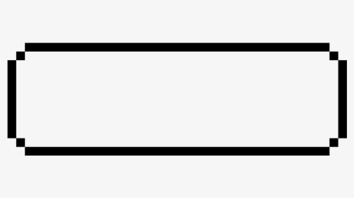
I have a game that looks a bit like a game from 1980. And i have this dialog:
#firstPageText {
            width: 300px;
            min-height: 100px;
            border: 2px solid;
            padding: 1em;
            margin: 0;
            position: absolute;
            bottom: 50px;
            left: 50%;
            -ms-transform: translate(-50%, 0%);
            transform: translate(-50%, 0%);
            font-family: 'Press Start 2P', cursive;
            border-radius: 5px;
        }
<link rel="preconnect" href="https://fonts.googleapis.com">
<link rel="preconnect" href="https://fonts.gstatic.com" crossorigin>
<link href="https://fonts.googleapis.com/css2?family=Press+Start+2P&display=swap" rel="stylesheet">
<p id="firstPageText">
This is a test text.
</p>I wanted to add a border-radius to this dialog like the ones from pokemon:
Is there a way to achieve this pixeled border-radius, instead of the rounded border-radius?
Solution
I would consider mulitiple background:
#firstPageText {
  --b:5px;  /* the thickness */
  --c:#000; /* the color */
  width: 300px;
  min-height: 100px;
  font-family: 'Press Start 2P', cursive;
  padding:calc(5*var(--b));
  position:relative;
}

#firstPageText::before,
#firstPageText::after {
  content:"";
  position:absolute;
  inset:0 0 50% 0;
  background:
    linear-gradient(var(--c) 0 0) 50%   0  /calc(100% - 4*var(--b)) var(--b),
    linear-gradient(var(--c) 0 0) 0%   100%/var(--b) calc(100% - 2*var(--b)),
    linear-gradient(var(--c) 0 0) 100% 100%/var(--b) calc(100% - 2*var(--b)),
    conic-gradient(from  90deg,var(--c) 90deg,#0000 0) 0    0/calc(2*var(--b)) calc(2*var(--b)),
    conic-gradient(from 180deg,var(--c) 90deg,#0000 0) 100% 0/calc(2*var(--b)) calc(2*var(--b));
  background-repeat:no-repeat;
}
#firstPageText::after {
  transform-origin:bottom;
  transform:scaleY(-1);
}
<p id="firstPageText">
This is a test text.
</p>Apply different colors to understand the puzzle:
#firstPageText {
  --b:10px; /* adjust this */
  width: 300px;
  min-height: 100px;
  font-family: 'Press Start 2P', cursive;
  padding:calc(5*var(--b));
  position:relative;
}

#firstPageText::before,
#firstPageText::after {
  content:"";
  position:absolute;
  inset:0 0 50% 0;
  background:
    linear-gradient(red 0 0) 50%   0  /calc(100% - 4*var(--b)) var(--b),
    linear-gradient(blue 0 0) 0%   100%/var(--b) calc(100% - 2*var(--b)),
    linear-gradient(green 0 0) 100% 100%/var(--b) calc(100% - 2*var(--b)),
    conic-gradient(from  90deg,orange 90deg,lightblue 0) 0    0/calc(2*var(--b)) calc(2*var(--b)),
    conic-gradient(from 180deg,purple 90deg,lightblue 0) 100% 0/calc(2*var(--b)) calc(2*var(--b));
  background-repeat:no-repeat;
}
#firstPageText::after {
  transform-origin:bottom;
  transform:scaleY(-1);
  filter:hue-rotate(180deg);
}
<p id="firstPageText">
This is a test text.
</p>- What is the difference between inline-block and inline-table?
- Array lists of HTML elements in order by website in selenium / beautiful soup
- EditorConfig extension for VS Code does nothing
- uploading HTML code to ebay store
- How to access all the direct children of a div in tailwindcss?
- How can I align a logo in the navbar header of an R shiny app created using bslib?
- Text to speech with avatar lip sync, no plug-ins
- ERR_CERT_REVOKED only on Smartphones (connection is not secure)
- IO Is Not Defined - Socket.io
- Is using <footer> inside <form> semantically fine?
- Embedding Reddit Post in Qualtrics Survey not working
- PHP Scrape html page content with tags
- Need to make a clickable <div> button
- What type of this element?
- Print and Print Preview of Web Page not Working Properly in Microsoft Edge Browser
- how can i get element height in javascript
- Scraping hierarchical website in a specific category
- Wrap <img> tag in a new tag and add alt attribute to the <img>
- Remove non-<img> tags from string
- regex for match all <img> tag and extract the "src" attribute
- Check for Table null in Jquery for JSON response
- jQuery how to add image from computer
- XPath for colspan attribute values as browser understands them?
- How to Ensure Each Table Column Occupies 25% Width and Allows Horizontal Scrolling in HTML/CSS?
- Get src value containing a specific keyword from all <img> tags
- How can I get a href,Image src,title from given html using DomDocument
- css animate from top to center
- How to Right-align flex item?
- How to add keydown listener to shadow dom
- Can a HTML telephone link accept spaces in the value?