htmlcssbackground-color
Explanation of a html and css trick for label background color
How can I make a performance like following image using HTML and CSS?
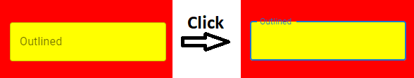
I mean, how the outlined label can disappear the border partially? Background color of the label supposedly is transparent!
Solution
You can use mix-blend-mode and isolation: isolate for masking parts of the border:
/*Blacks will persist, whites will be transparent*/
.border-label {
  mix-blend-mode: multiply;

  position: absolute;
  border: 2px solid black;
  background-color: white;
}
.border-label>label {
  /*Position centered on top border*/
  position: absolute;
  top: 0;
  transform: translateY(-50%);

  color: black;
  background-color: white;
}

/*Ignore, presentational; remaining styles and focus behaviour*/
body {background-color: red}

.input-wrapper {
  position: relative;
  background-color: yellow;
}
.input-wrapper>input {
  margin: 0;
  border: 0 none;
  padding: .6rem .8rem;
  width: 100%;
  height: 100%;
  display: block;
  font-size: inherit;
  background-color: transparent;
  outline: none;
}

.border-label {
  top: -2px;
  left: -2px;
  border-radius: 4px;
  width: 100%;
  height: 100%;
  transition: border-color .05s;
  pointer-events: none;
}
input:not(:focus)+.border-label {
  border-color: transparent;
}

.border-label>label {
  left: 0;
  margin-left: .2rem;
  padding: .2rem .4rem;
  display: inline-block;
  transition: top .05s;
}

input:not(:focus, :valid)+.border-label>label {
  top: 50%;
}
<div class="input-wrapper">
<input required>
<div class="border-label">
<label>Placeholder label</label>
</div>
</div>Unfortunately I'm not experienced enough with blend-modes and masking, so someone else may surely be able to improve my answer.
- My custom CSS transition animation is not working on hover after I added AOS JS library
- How to set data attributes in HTML elements
- How to get "Results per Row" (from a 'clicked entry' off a "dropdown menu") to show up correctly?
- How to reduce the size of an ASCII text art picture
- How to trigger SVG render same as manual DOM edit in Chrome using JS?
- Set element width based on a string that is not in the element
- Where are the trailing commas coming from in these radio buttons?
- 100vh height when address bar is shown - Chrome Mobile
- Capture selected option returns not defined instead
- Adjust navbar minimum height depending on screen width
- How to remove extra width from my website?
- Why doesn't backgroundColor=rgb(a,b,c) work?
- How to put json variable directly into DIV Class
- On hover the div inside button reduces height to give animation and little dark bottom. But text also moving up how to fix not move text
- WOW jquery slider
- Reduce the frequency of geolocation watchPosition calls
- Why should HTML elements (input, textarea, and select) have associated labels?
- Why ngModel doesn't works on the last version of Angular 17?
- How to make an element's background-color a little darker using CSS
- How do I clear the content of a div using JavaScript?
- How do I display images from Google Drive on a website?
- Tailwind h-screen doesn’t work properly on mobile devices
- Edit icon in mobile view missing
- Sticky header input scrolls on input
- Image not loading on local site I made
- React error in index.js, "Uncaught ReferenceError: dom is not defined"
- Make the mix-blend-mode on a sticky navbar ignore certain elements while scrolling down
- How to prevent bleach from escaping > (blockquote) tag used in Markdown
- Why is the input bar spilling slightly on the right side of the container?
- Method to show native datepicker in Chrome